The trend online that feels like everyone, including major brands, is adopting is serif fonts on their websites. Serif fonts, like Times New Roman, have a small line or stroke attached to the end of a larger stroke in a letter or symbol. Sans-serif, like Arial, do not.
Serif fonts are en vogue for 2019.
Two years ago it was hard to find a serif font on any website except maybe magazine sites, traditional brands, or old websites that haven’t been updated since serif fonts were fashionable the last time. These past few years were favoring sans-serif or script fonts. The shift to use more serif again is great because they are damn classy and can add a lot of character and personality onto a page.
Since Google Fonts are free to use and so easy to apply as a website owner, they make a good choice to quickly give your site a refreshed, current look. I’ve put together 10 Google serif font combinations you (and your visitors) will love this year.
- Anton + Scope One
- Bree Serif + Quicksand
- Coustard + Heebo
- IM Fell English + Assistant
- Libre Baskerville + Sarabun
- Lora + Open Sans
- Martel Heavy + Montserrat Light
- Merriweather Black + Merriweather Light
- Prata + Raleway
- Special Elite + Nixie One
For those of you who gravitate towards the strong towering letters of display fonts like Bebas Neue and Oswald, check out Anton paired with the sophisticated serif Scope One.

This is my personal favorite font combination. It’s quirky and inviting yet still looks professional and polished. It’s Bree Serif and Quicksand. You may have notice that I’m crushing on Bree Serif so hard that I’ve used it for my own heading text on this site (current as of January 2019).
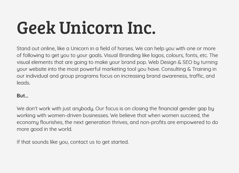
Heebo is one of my favorite sans-serif fonts. It is easy to read on a web page and manages to capture a warm approachable vibe while still keeping things professional. I’ve paired it with Coustard because it feels like an updated version of a traditional typeface with a touch of whimsy. This combo has friendly attitude and letters that are easy to read on a screen.
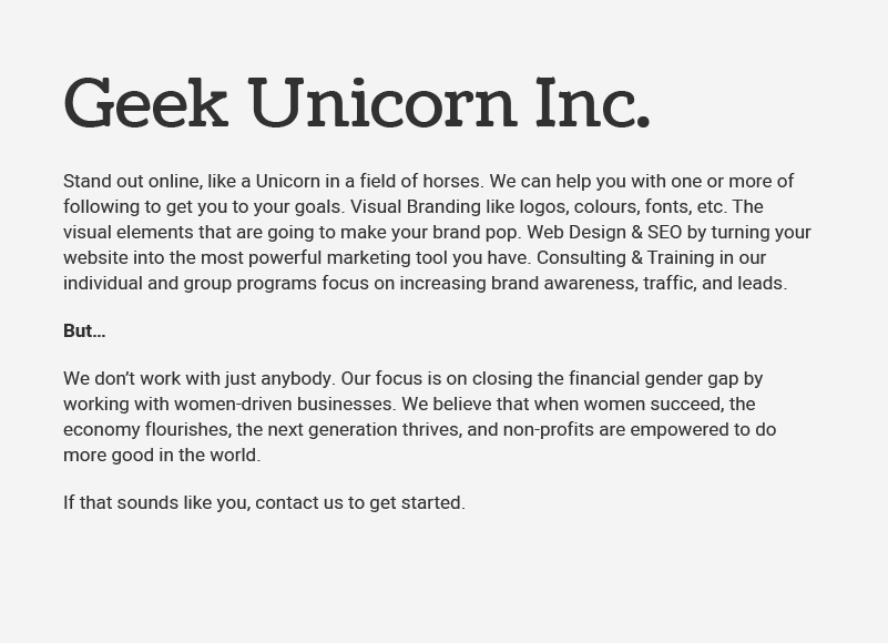
This is a serious mix of the past and future with IM Fell English and Assistant. There is a worn out granular edge to IM Fell English that feels like it’s ready to give you some no-nonsense sage wisdom like the old cowboy Curly from the movie City Slickers. Paired with the ultra modern, almost futuristic quality of Assistant, and you’ve got a combo that comes across as rooted in much history and ahead of its time.

When I think serif, my go-to is often Libre Baskerville. There’s just something about the strokes that change thickness ever so slightly with the round cut-outs that make it a thoughtfully crafted marvel of the circle and rectangle expertly stitched together to make a beautiful font. Paired with Sarabun, which feels like an HR manager with a type A personality who loves cats, and you’ve got a combo of artistic and thoughtful with by-the-books professionalism.

I used this combo myself for several months last year on my website. You can still see it in some of my downloadable PDF’s floating around in cyber space. I like it because Lora is clean and fresh with little bends where the strokes meet which give it some personality. Open Sans is a crowd-pleasing versatile font that goes with almost anything and pairs nicely here with Lora.

Martel Heavy paired here with Montserrat Light has a comic book hero characteristic to it that I love. It feels like Wonder Woman personified. It’s strong, it’s bold, and it means business.

Why mess with a good thing? Merriweather has a range of thicknesses that make it great to pair with itself. It’s an undeniable serif with a lot of versatility and is easy to read on screen. Plus it’s called Merriweather which adds a touch of joy to your soul. What’s not to love?

This combo of Prata and Raleway oozes sophistication and glamour. Perfect for any website that wants to convey their expertise as the pinnacle of their industry. This pair is particularly good for magazine-style sites.

If you want to ramp up the character and charm of serif fonts, then you might consider the classic typewriter feeling of Special Elite and Nixie One. I wouldn’t recommend this combination for everyone, but I think it would work great on certain lifestyle and recipe blogs. Something that needs to mimic a personable intimacy of a typed letter to the reader.

Which Google Font combination was your favorite? Is there a combo I left out that you think deserves a spot on the list? Leave your comment below.
Rachel McEwan
You Might Also Like
Branding (or Re-Branding) Checklist
Steal this style guide that uses 2019 design trends
31 Free Stock Photo Websites You Need To Bookmark Today

Been There, Done That Series: Designers Are Worth It

Been There, Done That Series: Rebranding Hip Mommies
Latest Posts

The Unicorn’s Guide to Marketing – Overview
Signs you need a new website

Reasons to support women-led businesses

How to measure Online Visibility

Best advice for increasing online visibility, from 20 marketing experts

How to add a user to your Google Analytics

Create a script text with glitter overlay on WordPress

Branding (or Re-Branding) Checklist

Four critical access points for your website

What you need to start a website
Prepare your brand for an online emergency


